Custom XAML Controllers I: Adding Custom Styles to Elements

This time im gonna talk about how to create custom styles to elements in Windows Phone. This also works for Windows Store apps to… It’s the same process. In my next posts I will go deeply on this matter but for now just to start things up we will start with a simple one.
I have created a new Windows Phone 8 project and named it as CustomStyles. Im not gonna walk through the process of creating a new Windows Phone project. And in the ContentPanel grid I have added a simple button control. This is the one we are going to change with a custom style. Simple but get the point across especially for newbies to WP and Store apps :)
Okay… This is the story. We have a plain old button here and its boring :D Right now it has the default style. White foreground (in Dark theme, black in White theme) When you tap on it the Phones theme color is used to as a highlight. Just the default stuff. Lets say I HATE THIS, for now YOU ARE TOO :D What I would like this to be is Green… Why? Coz I love Green LOL. Here is what we are shooting at.
When in Normal Mode, Its all Green, No border showing, Text it black (actually what I want is to text to have no color. Transparent so it shows the background). Then when it’s pressed the border shows green and the text show green. Fill is transparent. So let’s do it. :D
Here is the XAML code for the Button
<Button
    Content="Click Me Baby"
    HorizontalAlignment="Center"
    VerticalAlignment="Center"
    Height="100"
    Width="250" />
Note: Before starting I’ll make a copy of the button and leave it in the page so you can see the difference at the end.
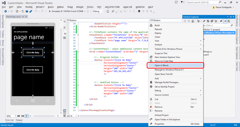
In the solution explorer Right click on the solution and then select open in blend.

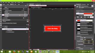
Then the project will open in blend.

Select the button on the bottom of the page. That’s the one we are going to edit. Now you have 2 options, you can Either Right click on the element on the designer and select Edit Template > Edit a Copy… or you can select the button from the Objects and Timeline panel and Right click and select Edit Template > Edit a Copy from there. It’s your Preference.

Next a dialog will pop up and ask for Name/Key used to identify the style (I gave GreenButtonStyle since I love green so much ;) ) and In the Define in section you have 2 options. This document and Application. Let me explain.

If you select This Document your style will be located in the current document you are working on. In our case it’s the MainPage.xaml. It will be listed in the PageResources section. It will only be available with in MainPage.xaml, nowhere else.
But if you want to use this button style all over your app you have to put it in Application level, that means in App.xaml file. To do this you have to select “Application” this will put the style in AppResources in App.xaml file.
I will select Application since I want to use this everywhere in my app. Reason? I love GREEN :D
Now you are in the Editing Mode :D On the left side, in the Objects and Timeline panel you can see all the little things your button is made of. There is a Grid surrounding all the elements, then there is a ButtonBackground which is a Border and ContentContainer which contains the text. Now we are ready to edit this.

First what I’m gonna do is change the color of the text. To do this I have to set the color of the text to a specific brush. Remember what we set out to do. The text of the button needs to be the same as the phone background color right. Since the background color of the app changes as the Theme change from Dark to Light and vice versa our text need to change color too. The best way to do this is like this. But first some background info…
There are some default colors that are called “Brushes” are used in Windows Phone. These come with the SDK and Microsoft recommends you use them in your UI design. These brushes are especially important when you create an app that uses “The Modern” design principle of Windows Store/Phone apps. Here in our case we need to use a specific Brush called “PhoneBackgroundBrush”. As the name suggests this brush takes the color of the current phone background. Either black or White. This is perfect for our task.
Now for more background Info :D This one is about Element States.
In XAML an element can have many states. In our example for a button there are states such as, Normal, MouseOver, Pressed, Disable which are default and the states that are most useful and we will work with them today. And there are “Focus States” such as Focused and Unfocused. We will be working with Default States. Normal state is the state where the button is in its default state. It’s not pressed. Mouse over is when the mouse is over the button and Pressed is the state that button goes to when it is pressed. We will be working with Normal and Pressed states. There is a default state where it is active when the button is disabled. If you plan to use a button disabled you need to edit this one too.

These states are listed in the “State Panel” in the left hand side panel dock. As you can see in the image. There are also Projects, Assets, Parts and Device tabs too. Right now we need to be in the States panel.
Finally the background info is over :D and we can get back to work.
First we will edit the normal state. Click on the normal state on the States Panel. As soon as you do that you will see your interface changes. A red border will surround the Designer area and Normal state will be highlighted with a red dot.

Damn it. It’s time for more background info :D
When you see a red border around the designer and a red recording symbol that means that you are in the State recording Mode. And State recording is ON. This is available for every state. When this happens any change you do in the designer will be recorded and added to that change. So BE SUPER CAREFUL when you work in this time. To turn recording mode off just click on the red recording symbol on the designer and it will go in to OFF mode. Than your changes will not be recorded. So I hope that’s the last of the “background info” :D let’s get back to it.
While in the Normal State recording ON, select the ContentContainer in the objects and timeline panel and you will see the properties associated with it appear in the right hand side properties panel. We need to change the Foreground property. There is a small yellow box in the corner. Click on that and select “System Resource > PhoneBackgroundBrush” . (In the System Resource menu you can see all the default brushes available in Windows Phone.) As soon as you do that you will see that the text will turn to black. If so you are doing fine. (If you have a light theme the text will be white). Next is to change the Border that means “ButtonBackground”.

We need to make the BorderBrush GREEN and the Background GREEN as well. :) So Select the ButtonBackground and in the properties panel change the BorderBrush and Background properties to Green.
Note: If you can’t select a color in the color pallet just go to System Resources by clicking on the yellow box and select any brush and apply it. Then go to the Solid color pallet and change the color.

Now your button should look like the one in the Screen Shot. If So great. You are good to move to the next part.
Next up is changing the Pressed State. Click on the Pressed state on the States Panel. Your Designer should still be surrounded by a red border and record symbol should still be on. As soon as you click the Pressed state your button will change color. You might be like WTF. :D Don’t worry its OK.. we are going to change it. Just for fun click back on Normal State and see that your changes are still there. So chill :D
Now again select the ContentContainer and go to the properties panel and Set the Foreground color to green (Don’t change anything else). This should change the text to green. (Remember our try it so in the pressed state to change the text to green and background to transparent and the border to green.) Next select ButtonBackground from the Objects and Timeline panel and change the BorderBrush to Green. And next select the Background and click on the green box infront of it (which was in others Yellow) and from the menu select “System Properties > TransparentBrush”. (Should be easy to understand. Transparent Brush has no color.) And BAM you have transparent background. So The button should look like the one in the screen shot bellow. :D

Click back and forth on the Normal and Pressed states to see how your button will look when its done. Actually it is DONE. :D now. You need to quit out of the editing mode. To do that Click on the icon that has a arrow pointing up in the Object and Timeline panel. See it in the bellow screen shot. When you hover your mouse over it, it should show “ Return Scope To [PhoneApplicationPage]. Click on it.

Yes we are DONE. Now save the changes by hitting Ctrl + Shift + S and exit blend. As soon as you move to Visual Studio You will be prompted that the Project is modified outside the VS editor and it need to be reloaded. Press Reload All. And you can see the changes in the Visual Studio.

Check out the modified button deceleration in XAML
<Button
    Content="Click Me Baby"
    HorizontalAlignment="Center"
    VerticalAlignment="Center"
    Height="100"
    Width="250"
    Style="{StaticResource GreenButtonStyle}" />
You are all set. Run the app and see the new button that is created. See how it behaves compared with the old button.

Now take a look at the code of MainPage.xaml. You will see a new attribute is added to the Button. It’s a Style attribute with a data binding to a StaticResource. What is this static resource and where is it from. Well it’s the Button Style we just created. See its called “GreenButtonStyle” and it is located in App.xaml file. Open it up and see for your self. Under <Application.Resources> tag you can see a huge amount of code is generated by the changes we made to the button style. And because this style is in the App.xaml file it is available to any page in the app. You can apply this style to any button by adding this property statement to the button declaration in XAML.
Style="{StaticResource GreenButtonStyle}"

Sooooo. That’s it folks for this post. Quite a long one eh? :D This is the longest one yet. But its complete. Have all the details you want. So in the next posts about XAML and Blend designing I will just do it at a fast phase. So then until next time Adios Amigos.
Oh BTW, Almost forgot.. You can download the Source Code from here. :D
Watch the Screen Cast of the Entire Tutorial On YouTube

You Might Also Like
← Previous Post
Custom Value Converters in XAML
July 13, 2014
Next Post →
Adding Your Own Photos to Windows Phone 8.1 Emulator
July 19, 2014


